
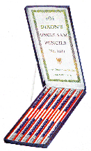
Before Dixon’s most famous No. 2 “Ticonderoga,” the company was already making these “Uncle Sam” pencils in red, white and blue.

The Meisterstuck Fountain pen, Montblanc’s most famous design, was introduced in 1924. Courtesy Montblanc Simplo GmbH.
Everyone knows the pen is mightier than the sword. But a quick look at how many museums and galleries proudly display weaponry of various kinds while ignoring the pen reveals that the object of that sentiment is a bit meek. Until now. The Providence Art Club has dedicated a new exhibition to the evolution of the pen – from its humble, nature-based beginnings to its sleek, ultramodern glory days, to the nostalgic elegance aimed at satisfying today’s computerized world. “Design in Hand: The Evolution of Writing Instruments Since 1784,” an impressive show with more than 350 pens and writing instruments, will open October 5 at the Art Club’s historic Deacon Taylor House.
Taking a look at the history of the pen, it is hard to imagine how our culture as we know it would have evolved without it.
The first writing instruments, several of which are on display at the “Design in Hand” exhibition, were closely linked to nature. They were made of metal, bone and ivory – and, of course, the quill. Exhibit curators Sara Agniel and Enrique Martinez tell us that the first quill pen was introduced in southern Spain around 600 AD, and that the quill reigned as the predominant writing instrument for the next 11 centuries until manmade ink nibs took over.
Of course, the quill intersects with American history as well, and among the pens of interest in the show is a quill used to sign the Declaration of Independence by Stephen Hopkins and William Ellery, the Rhode Island delegates to the Continental Congress.
The battle between the writing instruments of the New World and the Old continued. Although graphite was discovered in England, where export was strictly regulated and competition kept at bay, and Germany excelled at pencil-making, American companies, such as Ball, Thoreau and Dixon, were fast on their heels. By the late Nineteenth and early Twentieth Centuries, American manufacturers had caught up and soon surpassed them.
By 1913, the Dixon Pencil Company would symbolically name its famous – and now ubiquitous – No. 2 after Fort Ticonderoga, where the Revolutionary American forces were victorious over the British. One of these original No. 2s is on display in “Design in Hand.”
Among the writing-related objects on view in “Design in Hand” is the “Manifold Writer,” a device used during the Civil War to make copies. Made by the Francis and Loutrel Company of New York, the Manifold Writer employed carbonic paper and was used by military leaders between 1862 and 1865.
Other pens in the show, including pens made in the 1890s by the Paul E. Wirt Pen Company, were endorsed by Mark Twain in advertisements. Twain sang the praises of the Wirt pens’ smooth writing style and steady ink flow. Twain also endorsed the Conklin Crescent Filler, a fountain pen he said he favored because its shape prevented it from rolling off his desk.
But by the Twentieth Century, new designs and developments would change the course of handwriting. Making its way among other pen manufacturers, the Parker Pen Company took the lead in the 1920s and 1930s with innovative designs and a focus on new inks.
“The decades between the 1890s and the 1950s marked the golden age of the fountain pen, a period of fierce competition and continuous innovation culminating in the development of the Parker 51, widely acclaimed as the best pen ever made,” Agniel stated.
In fact, the Parker 51 was a design masterpiece. Streamlined and elegant, it was not the first pen of its kind, but it was considered the best. The pen was so good in part because it came with a new, fast-drying ink, cutely named “Quink,” which dried almost immediately, so that pesky smudges and runs were almost eliminated. But in this case, necessity was once again the mother of invention: the ink had a corrosive quality, which meant Parker, in 1939, had to reengineer the pen.
“They effectively turned traditional pen design inside-out, and so provided a capillary buffer of unprecedented capacity to even out variations in ink flow,” the curators wrote in the exhibition catalog. “This was all wrapped in an elegantly spare, streamlined body made of DuPont’s recently introduced Lucite acrylic.”
The Parker 51, which was named as such in part because its conception marked the company’s 51st anniversary, was released into the general market in 1941 at the then-sky-high price of $12.50. It got off to a slow start, but a year later the pen was written into history with chart-topping sales. Four years later, more than 1.5 million pens had been sold. Sales expanded exponentially from that point. Eventually, until production ended in the 1970s, Parker sold $400 million worth of the pens.
“The Parker 51 is one of the seminal designs of the Twentieth Century,” Agniel said. “It was a huge moment in industrial design, and it is unbelievable how many of them were sold. It was the best-selling fountain pen of all time.”
And it is among the most collected, a curious fact since the pen was mass-produced. David Nishimura, an expert on pen collecting who advised the curators on the Parker 51, explained why the pens are so avidly collected.
“Like many great objects, the classic 51 defies easy analysis: every line is as it should be, every proportion is just right. Further improvement is simply inconceivable,” Nishimura wrote in his essay for the catalog. “No wonder that the 51 became an international icon, inspiring copies worldwide. Yet the borrowings by other pen makers were always superficial: none of the copies compares with the original in either aesthetics or technical sophistication. Paradoxically, this even applies to Parker’s own recent ‘reissue’ of a special edition 51 targeted at collectors.”
Of course, cultural shifts are still inspiring design changes. With the advent of email and the computer age, pens are evolving again. Handheld units use penlike instruments to generate an electronic form of writing, and new technology is now capable of playing intermediary between the tip of a pen and paper. And modern pens reflect our postmodern era. Some are now fitted with ergonomic grips and other means of making writing more comfortable, and many pens are more like toys or personalized gadgets.
Perhaps less versatile – but equally important – is the pencil, and Agniel and Martinez have paid tribute to the graphite wonder and how it, too, has evolved.
“But many fewer pencils have survived the test of time,” Agniel said. “They are very rarely traded once they are sharpened. Once a pencil is sharpened, it is a little like driving the car off the lot. They are not worth as much ever again. Pens, however, did not diminish in value because they were used.”
The “Design in Hand” show is the brainchild of Art Club coordinator Iona Dobbins. While researching the history of the Art Club’s circa 1784 Deacon Taylor House, she discovered that the house was once the headquarters of the Pen and Pencil Club.
“I found out that the Pen and Pencil Club owned the house in the 20s,” she said. “So I thought it would be great to have an exhibition, and we started wading through the literature and pulling it together.”
With some help from articles published by the Smithsonian, Dobbins narrowed down the scope of the project and set out to find curators for the show. Eventually she found Agniel, an art historian and director of Gallery Agniel in Providence, and Martinez, design director of Muchi Muchi, a Providence-based design house.
In addition, “Design in Hand” will coincide with a major pen fair that will take place October 18 at the Benefit Street Armory in Providence. Between 10 am and 5 pm that day, thousands of pens will be on display and for sale.
Although many pen experts are expected to descend on the city that day, this exhibition is the first to take such a close look at the history of writing objects.
“The pen fair will be an event in itself,” Martinez said. “But the exhibit unveils how something as simple as a writing instrument has a great deal of design evolution in it. It is amazing how something so simple can be very complex. Some are sublime, some are inexpensive, but they are all part of the same thing.”
The show, on view through November 2, can be seen at the Providence Art Club, 11 Thomas Street. For information, 401-331-1114 or www.providenceartclub.org.
