
Colors in fashion come and go. One, however, has sustained at the margins of Western taste for many centuries – blue – and is the subject of an enlightening and enjoyable exhibition currently on view at the American Folk Art Museum. “Blue,” through March 6, assembles 30 paintings, textiles and ceramics from the museum’s collections that illustrate the predominance of this color in American art and social life since the Eighteenth Century. Stacy Hollander, senior curator, recalls that the origins of the exhibition were serendipitous, with her attentions first drawn to the museum’s textile holdings. Eventually, she realized, her reflections centered not on one medium but on one color. So she set out to organize an exhibition on the “history, mystery and use of blue.” In light of the theme, only predominantly blue works are on display. The visitor thus risks forming a distorted view of the color’s popularity – but not by much. By the Eighteenth Century, there was a flowering of blue in art, interior design and clothing after a slow emergence dating back to the Middle Ages. The origins of color might seem reductive for anyone wholives near an art supply store. “You don’t think about where colorscome from,” Hollander says. But the use of a color by artists andartisans is – it goes without saying – influenced by itsavailability in dyes and paints. In the case of blue, the mosteffective pigments traditionally had exotic origins. Ultramarine,for instance, was extracted from lapis lazuli mined in Afghanistanuntil the invention of a synthetic version in the 1820s. Another, more common colorant was indigo, which was harvested in many parts of the world – but not in Europe. In the New World, indigo thrived in places like South Carolina and the West Indies. Indigo-dyed quilts still startle by the durability of their color. The New England “Calimanco Quilt,” 1780-1820, is a saturated field of blue, with the intensity of the color drowning out the dainty rococo scrollwork. The “Calico Quilt with Border,” 1810-1820, also defies time with its deep two-toned design. “Indigo is permanent,” says Hollander, “it doesn’t fade, though it can be rubbed off over time.” (“Faded” blue jeans are a case in point.) Indigo-dyed quilts continued to be made through the Twentieth Century, especially in Amish communities. Due to their proscription of nonutilitarian decoration, Amish design emphasizes color and abstract forms (“Double Inside Border Quilt,” 1910-1925). Indigo had a more complicated history in Europe and Great Britain, where for many centuries blue dyers relied on woad, an herb in the marigold family. Textile manufacturers in France and Germany were familiar with indigo, but until the 1730s were prohibited from using it to protect the farmers and merchants dealing in native woad. In England there was less resistance, thanks to English profits from the West Indian indigo plantations. By the time Bromley Hall printed “Bamboo Trails,” a copperplate cotton and linen mix, 1785-1790, the transition to indigo had been complete for decades. The colorant was not the only exotic thing about this fabric. The bamboo theme was vaguely Asian, while the blue and white colors reflected the more specific influence of Chinese porcelain. One legacy of woad was the association of light blue with workman’s clothing. The wealthy, after all, were already wearing indigo-dyed garments when the poor were still wearing woad-dyed garments, which were lighter in color, even when new. The spread of indigo-dyeing redeemed light blue from such low class ties, and it became a favorite color among people of fashion. Mrs Fitzhugh Greene of Newport, R.I., who is believed to be the subject of the portrait attributed to John Durand (“Portrait of a Woman,” circa 1768-1770) is wearing a light blue silk dress with lace, which was another high status fashion. Like all decorative arts exhibitions, “Blue” is not just about the things people once liked to have in their homes. Scientific discoveries, best selling novels and trade barriers also enter into the matter. “The history of blue gets bound up in social, cultural and historical trends,” says Hollander. Take the portrait of “Jonathan Knight,” circa 1797, by an unknown Connecticut painter, which depicts a seated boy with an open book at a drop leaf table. The many shades of blue depicted in the portrait were acquired from disparate sources. For example, Hollander points out that Prussian blue was used to depict the walls in the Knight home. Prussian blue, the first synthetic color, was discovered by accident in Berlin between 1704 and 1707. It was known as iron blue in America, where it was being used in interior decoration by the 1720s. “Prussian blue is familiar to students of early American art because it was ubiquitous in the Eighteenth Century,” says Hollander. The fact it figures in the painting is a curious mixing of the medium with the subject. Young Jonathan Knight is wearing an indigo-dyed wool jacket paired with yellow trousers, which was a modish combination at the time. The origin of this fashion was Goethe’s Sorrows of Young Werther, an early Romantic novel published in 1774, whose eponymous hero wears just such an outfit. By the time Master Knight had his portrait painted in the late 1790s, the associations with the novel were probably remote. The custom of pairing a blue jacket with yellow trousers lingered on, though, into the first third of the Nineteenth Century, more than a generation after the novel was first published. Jacob Maentel (1778-1863) depicts this enduring fashion in “Father and Daughter of Elizabethtown, New Jersey,” circa 1815-1820. Maentel’s upstanding burgher is far removed from Goethe’s loquacious parasite. Another portrait by Maentel, “John and Catherine Bickel,” circa 1815-25, is also, implicitly, a study in blue, with the subjects sitting in a room with stenciled blue walls. The wall pattern seems derived from a textile similar to the dress worn by the girl in Maentel’s “Father and Daughter.” The exhibition also addresses the significance of Chinese export porcelain, whose blue and white color scheme exerted a lasting influence on other ceramics. This influence is evident in the stoneware “Punch Bowl,” 1811, which is attributed to New York potter John Crolius Jr. According to the bowl’s inscription, the piece was made for a wedding or anniversary in one of New Jersey’s founding families. Like Chinese porcelain, the stoneware punch bowl owed its flowery decoration to cobalt, which was first used as a coloring agent beginning in ancient times. A half-century later, cobalt – a poisonous, arsenic compound – was still being widely used for the embellishment of stoneware, often masterfully, as was the case in the product made by J. & E. Norton in Bennington, Vt. Cobalt was not merely dangerous, it was also expensive;hence, the folly of coating the exterior of a vessel with thestuff. At the Frey Family Pottery in Pennsylvania, some artisan didjust that with the wide-mouthed jar, circa 1810-1846. In contrastwith the restrained decoration found on virtually all otherstoneware examples, the Frey potter used the occasion to lather iton, resulting in cobalt streaking down the sides. The preciousness of color is a point that does not go overlooked in the show. A “junk” (or cake) of indigo is on display, as are vials and mounds of pigments. Most research in the practical issues was undertaken for the dyeing industry. Paint pigments were a far less lucrative field, though to painters professional supplies must have seemed costly. Dry pigments were sold by chemists or druggists, like James Peter of Lancaster, Penn., who advertised in 1764 his inventory of “all sorts of colors neatly prepared either for house or face painting.” (The latter was a reference to portraiture.) The “Paint Box” of the portraitist Erastus Salisbury Field, 1805-1900, is typical of how dry pigments were traditionally stored. Once mixed, oil colors were stored in pig bladders. The invention of metal paint tubes in the 1840s eventually obviated the need for these practices. Field was an old fashioned artist, however, so he ground and mixed his colors until the end of his career. Field’s paint box is a tribute to the closing days when colors came from strange lands or represented some scientific advance. The romance of blue is on display in this well organized exhibition. The American Folk Art Museum, open Tuesday through Sunday, is at 45 West 53rd Street at Sixth Avenue. For information, 212-265-1040 or www.FolkArtMuseum.org.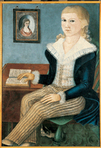
04 Jan 2005 / 0 Comment
‘Blue’ at the American Folk Art Museum
Published: January 4, 2005
This anonymous portrait of Jonathan Knight, circa 1797, shows a small boy fashionably dressed in yellow trousers and a blue jacket. Also in evidence is the popularity of Prussian blue, the first synthetic color, which was used here as wall paint.
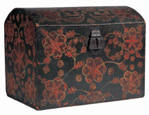
Delicate foliage and blossoms embellish a humble dome top storage box, circa 1800-1840, from Lancaster, Pa. Paint on poplar with sheet-tin hasp and hardware. Collection American Folk Art Museum, promised gift of Ralph Esmerian.

Antiques and The Arts Weekly is the nation’s leading weekly publication on the antiques and the arts trade, and is available both in print and online.
Each issue average between 100-200 pages and includes reporting on auctions, antiques shows and the arts while providing a platform for both buying and selling.
We have been providing breaking news and important information on the world of antiques and the arts since Publisher R. Scudder Smith started Antiques and The Arts Weekly back in 1963.
Contact
LOCATED AT:
5 Church Hill Road / Newtown, CT 06470
HOURS:
Mon - Fri / 8:00 am - 5:01 pm
PHONE:
(203) 426-8036